Cloud Service Status Redesign
Turning a flat, real-time status grid on the SAP Trust Center into a three-level system - product overview, per-data-center detail, and historic incident lookup - for the enterprise IT and ops teams who depend on it to plan around downtime.
The problem
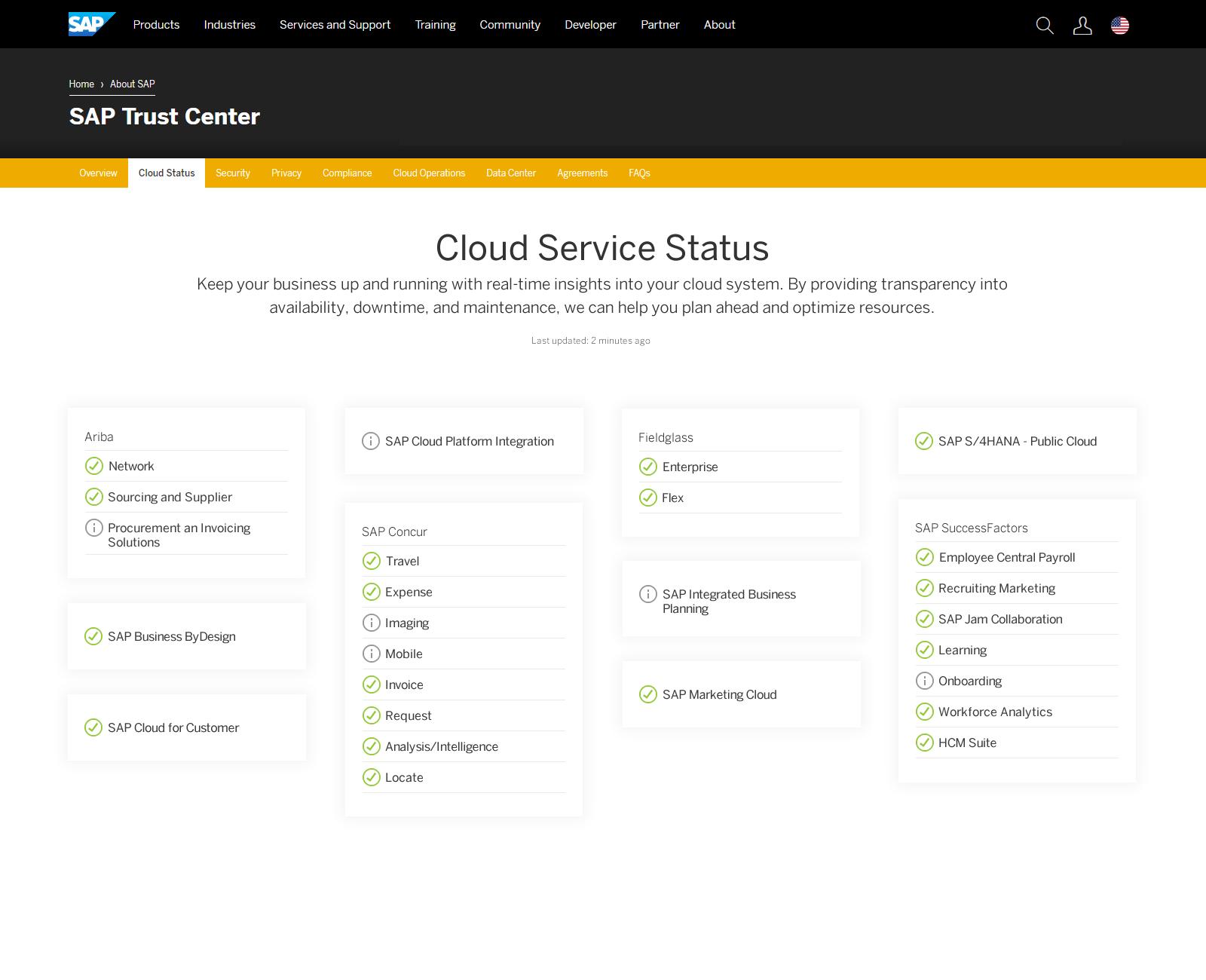
The Cloud Service Status page told customers whether a service was up right now - and nothing else.
It was a flat grid: each SAP product (Ariba, Concur, Fieldglass, SuccessFactors, and dozens more) grouped under its line of business, with a green check or an info icon next to it. That's useful for a single glance, but it broke down for the audience who actually relies on this page - enterprise IT and operations teams doing capacity planning, post-incident reviews, or explaining an outage to their own leadership. They needed to see which data center was affected, when, for how long, and whether it had happened before. None of that existed on the page.
The redesign: a three-level system
Rather than add history as a bolt-on, I restructured the page around three levels of increasing specificity - each one answering a different question.
Product overview
All products, alphabetically sorted, with a dynamic search field and aggregated status rolled up across every data center a product runs in.
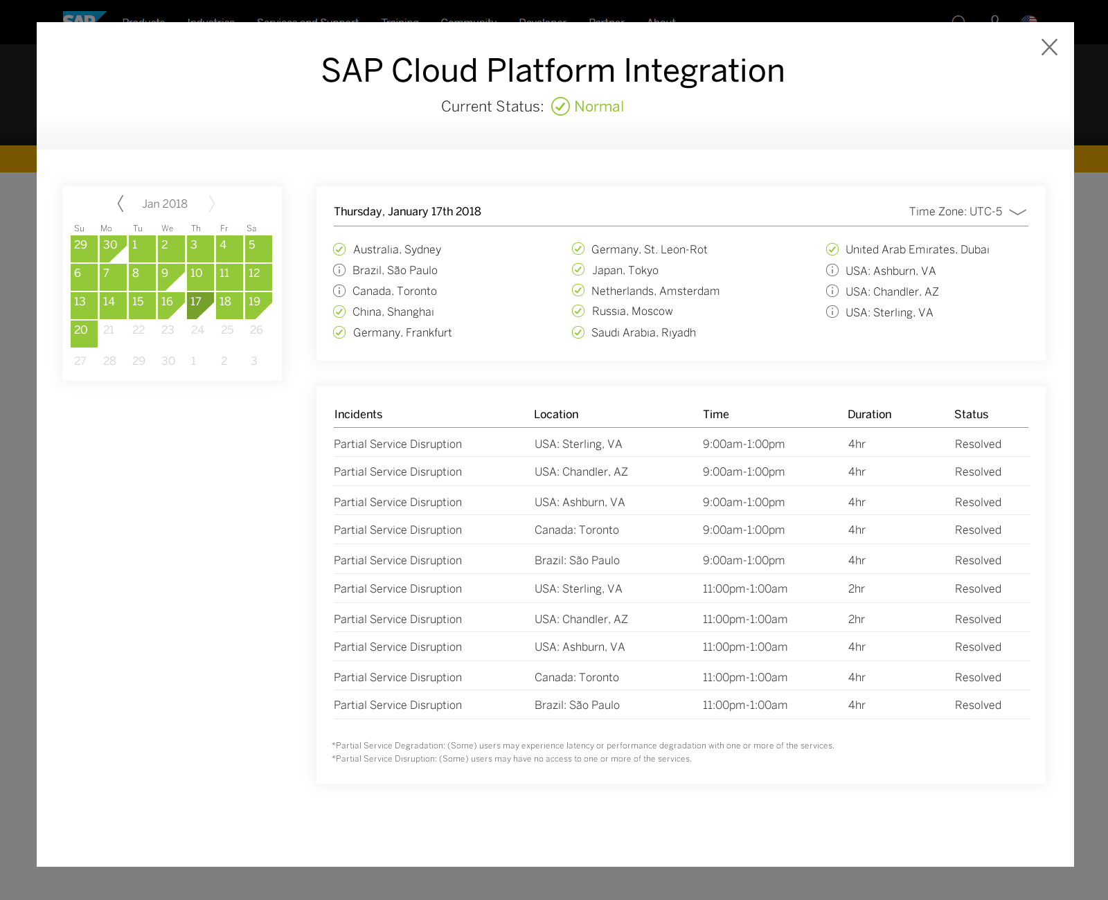
Product / data center view
Select a product to see every data center it runs in, each with current status, plus a running list of that day's incidents if any are active.
Historic view
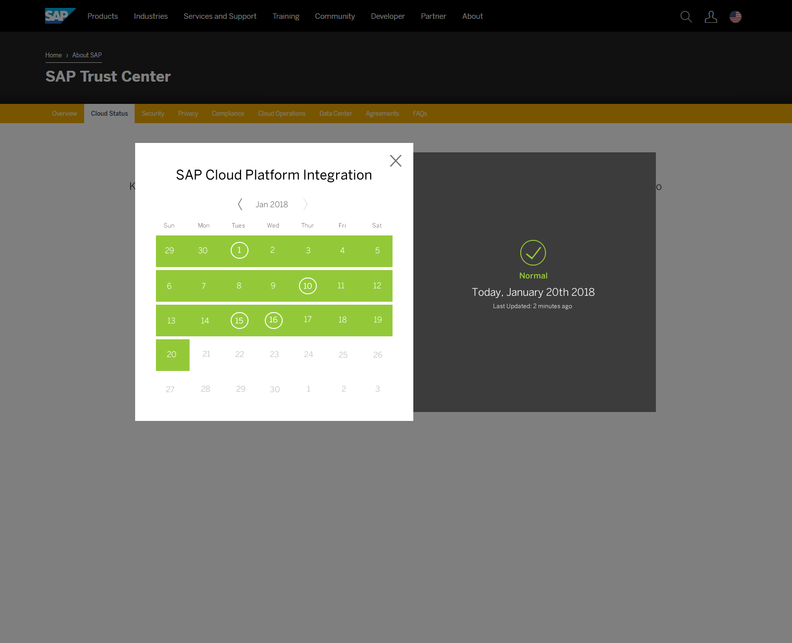
A calendar to select a past day for a given product and data center, showing incident details - type, time, duration, and resolution status - for that day.
Designing within real constraints
This went through stakeholder and engineering review before anything was finalized, and the feedback shaped real decisions - not just visual polish. A few examples pulled directly from that review:
- → A stakeholder wanted the calendar view available as a second step after a user picked a data center - which is what became the Level 2 → Level 3 flow.
- → Engineering asked whether calendar weeks older than the retained history (4 weeks) could be grayed out, with the "back" navigation disabled past that point, rather than showing dead ends.
- → The historic view needed a clear heading naming the data center and stating it was a historic (not live) view, so it couldn't be mistaken for current status.
A few decisions that came directly out of stakeholder discussion:
• Bucket incident information by duration - yes
• Include data center as an additional bucket/facet - yes
• Show a list of incidents per location - yes
• Hover-to-explain interaction pattern - left open (TBD)
• Static "last updated" label vs. live timestamp - left open (TBD), pending an API discussion
Then, shipped, and now
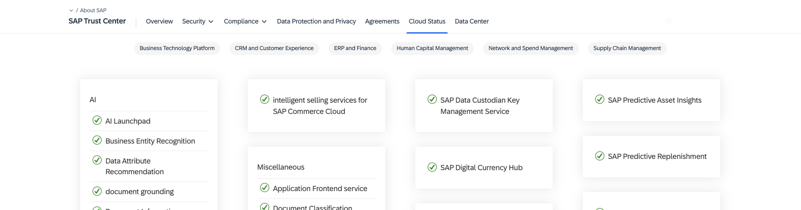
This redesign went live in 2020. The page kept evolving well past that: today's live site has landed on a searchable, category-filtered grid rather than the full calendar drill-down designed here, and has moved deeper per-tenant history behind the authenticated "SAP for Me" customer portal. But the core ideas from this redesign - search, structured grouping, and treating this as a real tool rather than a static status light - carried through to what's live today.
2018 - flat grid
2020 - shipped redesign
Live today - searchable, filterable
What Natalie should add to finish this case study
- Your specific role and the stakeholders involved (the deck references a reviewer named in the feedback - I generalized this to "a stakeholder" and "engineering"; let me know if you want it more specific).
- A screenshot of the Level 1 overview grid concept specifically, if you have one - the current visuals cover the starting grid, the Level 2/3 drill-down, and the live evolution, but not a mockup of the redesigned Level 1 overview itself.
- Any metrics or feedback from the 2020 launch, if you have them - support ticket volume, customer feedback, adoption of the drill-down.
- Confirmation these screenshots are OK to publish - same confidentiality check as the other case studies.