Visual Design for the SAP Design System Homepage
A focused visual design pass on the SAP Design System's own homepage - evolving it from a functional reference page into a cohesive, modern front door, and handing the direction off to the Product team to build.
The brief
Leadership wanted the Design System's own homepage to look like it belonged to the design system it was documenting.
"The goal is to create a consistent and scalable design within our new brand strategy."
Leadership notes
- A cohesive design that reflects SAP products and our brand visual language
- Crisp, clear and modern components
- An evolution of the SAP user experience
- User-centric, with a seamless design pattern
- A fun animated effect for the hero
My scope was specifically visual design - the enhancements needed to bring this page up to the standard the rest of the SAP brand was moving toward, packaged as direction for the Product team to implement.
Challenge, opportunity, approach, execution
The framework I used to move from a leadership note to a shippable direction.
Challenge
The current experience was fragmented, with inconsistent flows and disjointed design patterns disrupting usability and continuity. Design decisions had historically lacked a strong data-driven foundation, and the experience was heavily tailored to advanced technical users - leaving broader audiences underserved.
Opportunity
Evolve the SAP user experience into a cohesive, intuitive system by standardizing and scaling consistent design patterns - leveraging data and user insight so improvements stayed grounded in real user needs, and expanding usability to a wider range of personas.
Approach
Aligned the product experience with the brand visual language for consistency and clarity, integrating UX design with analytics to guide decisions. Key user journeys were defined using behavioral metrics, and friction points surfaced through user surveys and qualitative feedback.
Execution
Translated research, analytics, and feedback into actionable requirements - clean, modern designs aligned with the brand, standardized components, and optimized key journeys. Animated elements enhanced engagement, validated through iterative testing and cross-functional collaboration.
From static concept to animated hero
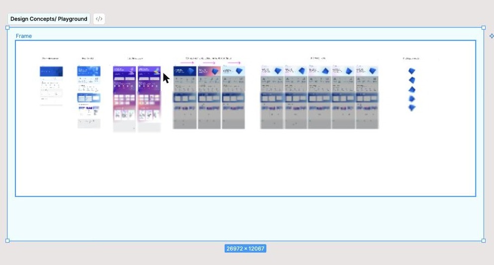
The brief specifically called for "a fun animated effect for the hero." I explored that across several rounds - starting from a light, static enhancement of the existing page, through a bolder colorful expression, and landing on a 3D hero graphic with a subtle animated color shift that felt modern without competing with the content below it.
The direction I handed off
The final direction: a full-bleed blue hero with a 3D isometric graphic and a soft animated color shift, "The future of the SAP Design System" as the headline, paired with role-based entry points so different audiences could self-select their path in rather than reading a generic homepage.
Content strategy & wayfinding
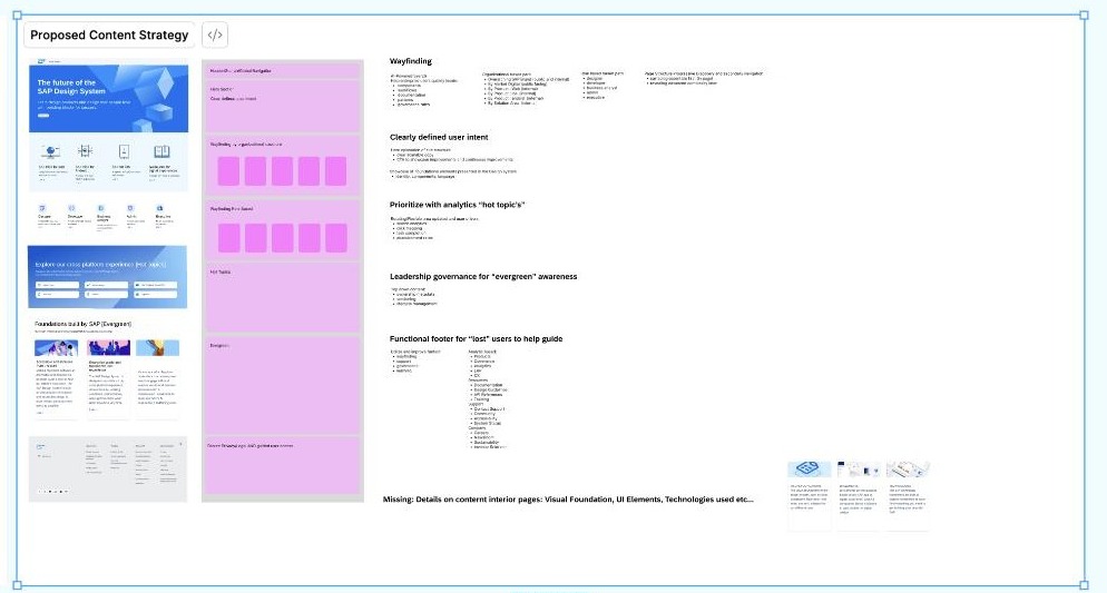
Visual design alone doesn't fix a page people can't navigate. Alongside the hero and layout work, I proposed a content strategy addressing four specific problems:
- Clearly defined user intent - new organization of content grouped by what a visitor was actually trying to do, not by internal team ownership.
- Prioritize with analytics "hot topics" - surfacing what data showed people were actually looking for, instead of guessing. The Hot Topics area itself was built to be stakeholder- and touchpoint-specific, so each entry point could surface what mattered to that audience rather than one generic list. A related "Trending" mechanism was designed to keep updating on its own - pulling from heatmapping and analytics on an ongoing basis rather than being manually curated once and left to go stale.
- Leadership governance for "evergreen" content - a clear owner and review cadence for content that shouldn't go stale.
- A functional footer for "lost" users - a real wayfinding tool, not an afterthought link dump.
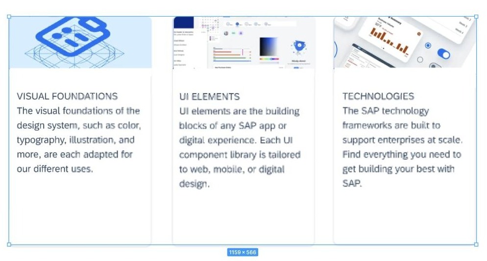
I also proposed a "Foundations built by SAP" section to orient new visitors around the three pillars of the system:
Where it stands today
The direction shipped, and the page is still live and actively maintained. The Product team evolved it further after I handed off: the hero kept the same blue brand world and geometric motif I proposed, but simplified from a 3D animated diamond to a flat, single-shape outline - likely a performance and accessibility call - and the entry points shifted from the five persona-based cards I designed (Designer, Developer, Business Analyst, Admin, Executive) to four platform-based ones (SAP Fiori for Web, Android, iOS, and the Digital Design System).
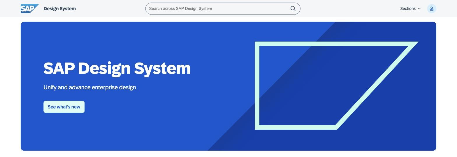
Note: I checked the Wayback Machine for an earlier snapshot to show the immediate post-handoff state, but its earliest capture of this page is from May 2025 and didn't render - the page is client-rendered and archive.org couldn't capture its data. What's shown above is the current live version for comparison against the direction I delivered.
Handoff: final thoughts for the next team
I handed this off at a natural stopping point, as I moved on to two other design initiatives in parallel. My notes for whoever picked it up next:
Draft - personalize this before publishing; I don't have your literal handoff notes, only what's inferable from the working file.
- The Hot Topics area is stakeholder- and touchpoint-specific by design - don't collapse it into one generic list per convenience; that defeats the point.
- Trending was built to keep pulling from heatmapping and analytics on an ongoing basis. It needs someone to own that feed, or it'll quietly go stale.
- The persona-based entry points (Designer, Developer, Business Analyst, Admin, Executive) were a deliberate choice to help people self-select by role rather than dig through navigation - worth understanding why that changed before assuming platform-based framing is strictly better.
- The 3D animated hero was meant to signal "this is the future," per the original brief - if it's simplified for performance, that trade-off is reasonable, but it's worth revisiting once performance headroom allows.
What Natalie should add to finish this case study
- Timeline - when this project ran and when it shipped.
- Real before/after metrics (engagement, time on page, bounce rate) if you have access to them.
- Clean, final exports of the hero animation (ideally a short video/GIF of the 3D color-shift effect) rather than the working Figma board shown here.
- Your actual handoff notes, to replace the drafted version above.
- Confirm whether "SAP Design System" branding and screenshots are OK to show publicly, same consideration as the other SAP case studies.
Note: the process visuals on this page are cropped screenshots pulled directly from your working Figma file (exploration boards, not polished export assets), so they show cursor marks and selection outlines. Swap in clean exports once you're ready to publish this - happy to help re-export cleanly from Figma if you share access again.