Global Navigation & Footer System, Across 7 SAP Touchpoints
A consistent masthead, footer, and wayfinding system built to work across seven distinct SAP digital properties - unifying content strategy and design where every property had previously evolved on its own.
The problem
SAP's web presence wasn't one site - it was seven, each with its own history, its own team, and its own idea of what the header and footer should say.
Global (including Product, Account, Contact, and Wayfinding), Industries, Services and Support, Community, Learning, Partner, and About had all grown up somewhat independently. Navigation labels, footer link structures, and wayfinding conventions drifted apart property by property - so a visitor moving from, say, Learning to Partner could hit a completely different mental model of how to get around, even though it was still "SAP."
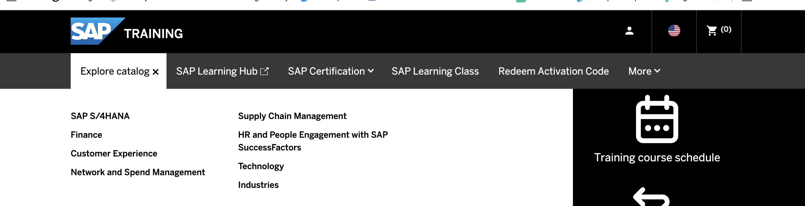
The 7 touchpoints
The system needed to hold up consistently across all of these, without flattening what made each property distinct.
SAP Global
Includes Product, Account, Contact, and Wayfinding
Industries
Services and Support
Community
Learning
Partner
About
Approach
Two disciplines had to move together on this: the content strategy that decided what belonged in the navigation and footer in the first place, and the design system that made it usable and consistent everywhere it appeared.
Content strategy
Rationalized navigation labels and footer link groupings across all seven properties into a shared taxonomy - so the same kind of link lived in the same place with the same name, no matter which property you were on.
Design system
Built a masthead and footer component that could flex to each property's needs (Product navigation vs. Partner navigation, for instance) while staying visually and structurally consistent as a system.
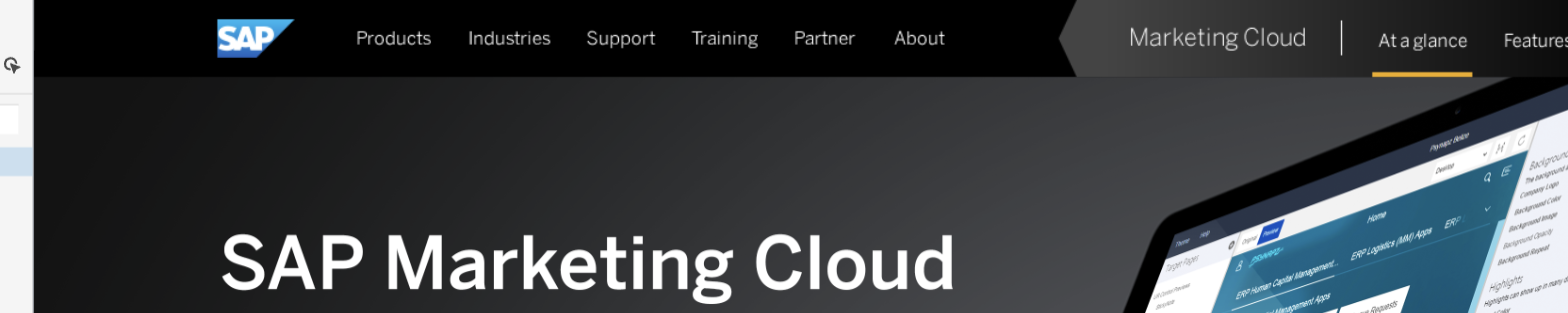
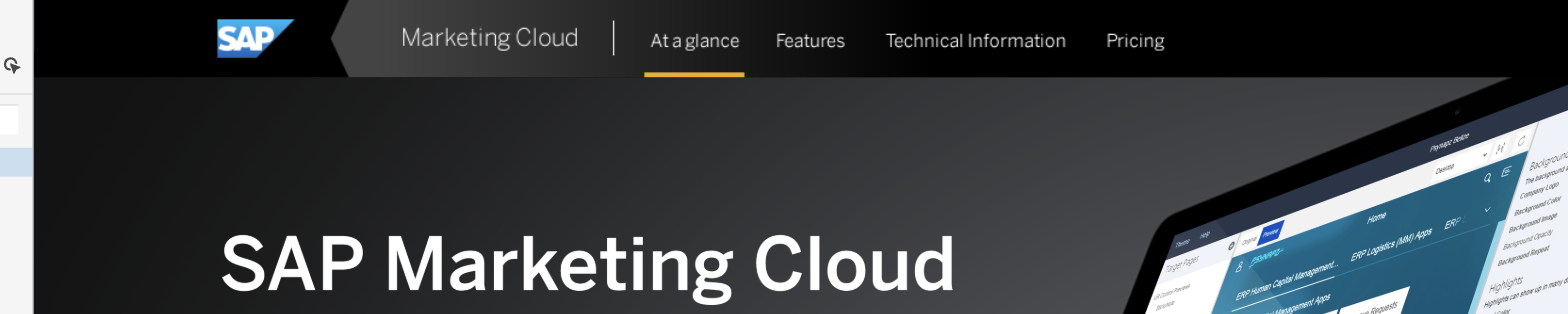
Before the system could be standardized, it had to be explored. I tested how much of the global masthead should persist once someone was deep inside a single product page - keep the full top-level nav present at all times, or step back to a leaner, contextual treatment scoped to that product.
Concept A - persistent global nav
Concept E - contextual only
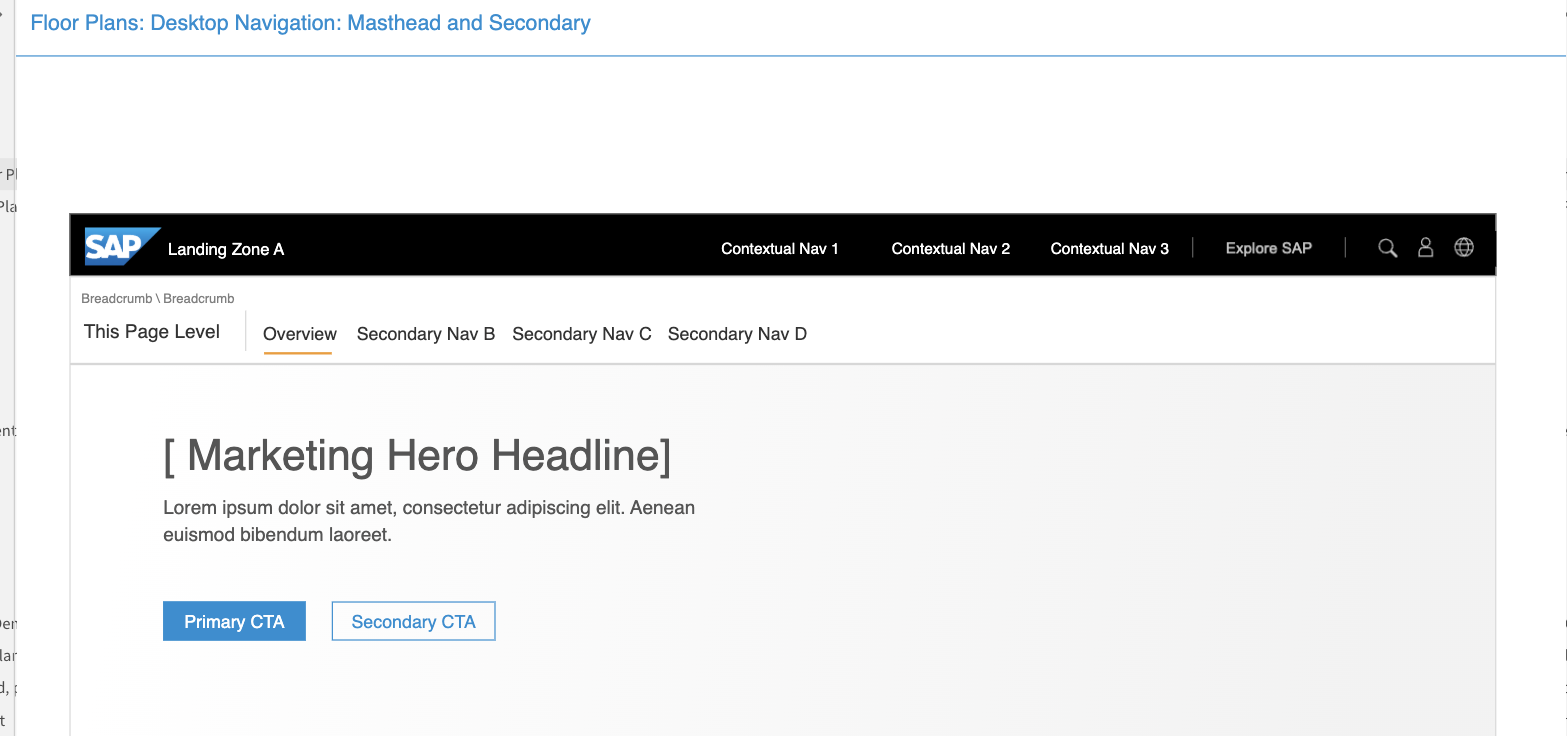
That exploration fed directly into the formal floor plan below - the masthead and secondary navigation structure ultimately adopted across all seven touchpoints: a persistent top-level bar (logo, contextual nav, Explore SAP, utility icons) paired with a page-level secondary nav underneath it.
Products: the mega-menu
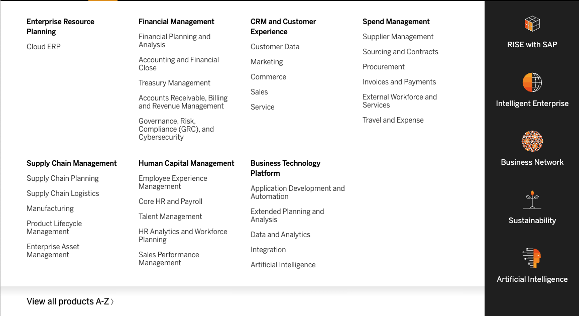
"Products" carried the heaviest load of any masthead item - SAP's entire portfolio, organized so a visitor could scan by business function rather than product name. This is the 2023 version: seven categories (Enterprise Resource Planning, Financial Management, CRM and Customer Experience, Spend Management, Supply Chain Management, Human Capital Management, Business Technology Platform) as scannable columns, plus a dark rail of icon-led strategic links - RISE with SAP, Intelligent Enterprise, Business Network, Sustainability, Artificial Intelligence - for the cross-portfolio narratives that don't live under a single category.
2023
Live today
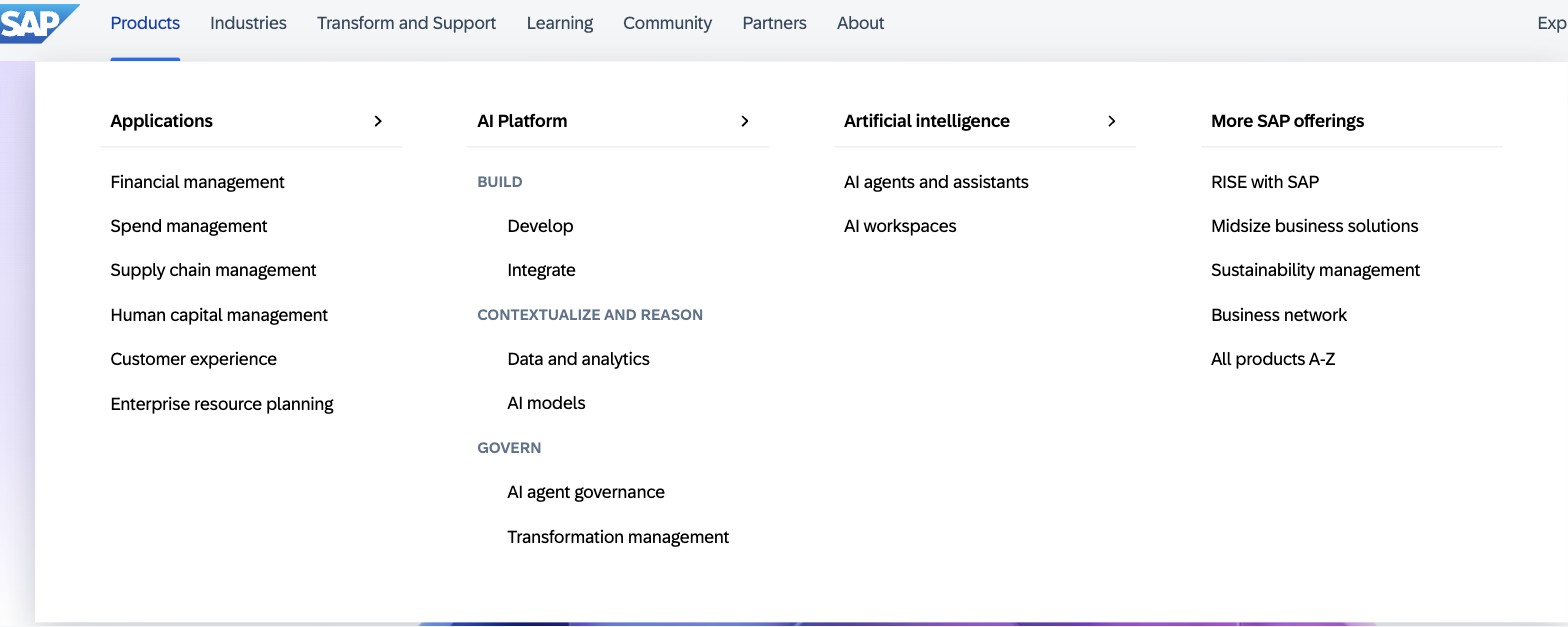
The category-first structure held - it's still four scannable columns with "All products A-Z" as the escape hatch. What changed is what earned top billing: "AI Platform" is now its own full column, subdivided into Build, Contextualize and Reason, and Govern, with a dedicated "Artificial intelligence" column alongside it. The rest of the portfolio consolidated into a single "Applications" column. It's the masthead-level evidence of the same shift visible on the homepage - SAP reorganizing its front door around AI rather than treating it as one category among many.
Explore SAP: the connective layer
A masthead that's merely consistent still leaves seven separate silos. "Explore SAP" was the piece designed to fix that - a persistent, global navigation element meant to actively connect all seven touchpoints to each other, rather than just standardizing each one in isolation. Its purpose was to make the breadth of the organization visible in the moment: someone deep in Learning or Community could see and reach Industries, Partner, or About without backing out to a generic top-level site map. It turned the navigation from "consistent per-property chrome" into a real signal of how vast and interconnected SAP's network actually is.
The footer: SEO-informed, not a link dump
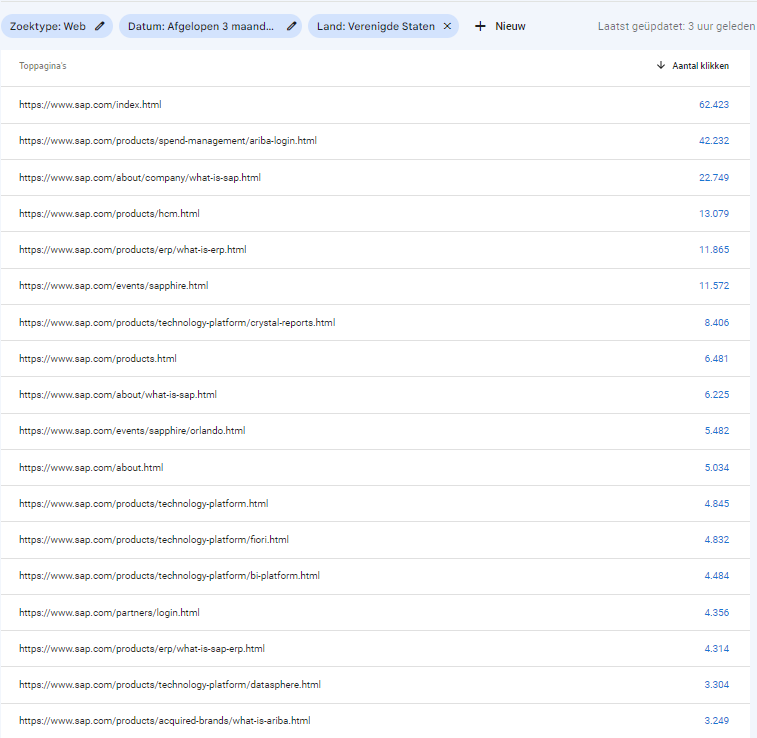
The footer ran on a different kind of input than the masthead: SEO recommendations, grounded in which pages people were actually finding through search. The proposal wasn't to shrink the footer or pad it out - it was to treat every link as something that had to earn its spot, swapping low-value links for the site's genuinely high-traffic and high-priority pages, and adding a dedicated "Learn" section for top "What is…" content (What is ERP, What is SAP) that search visitors were already looking for. It followed the same "fat footer" pattern used by Salesforce, Oracle, SAS, and IBM - treating the footer as a real index of the site rather than an afterthought of legal links.
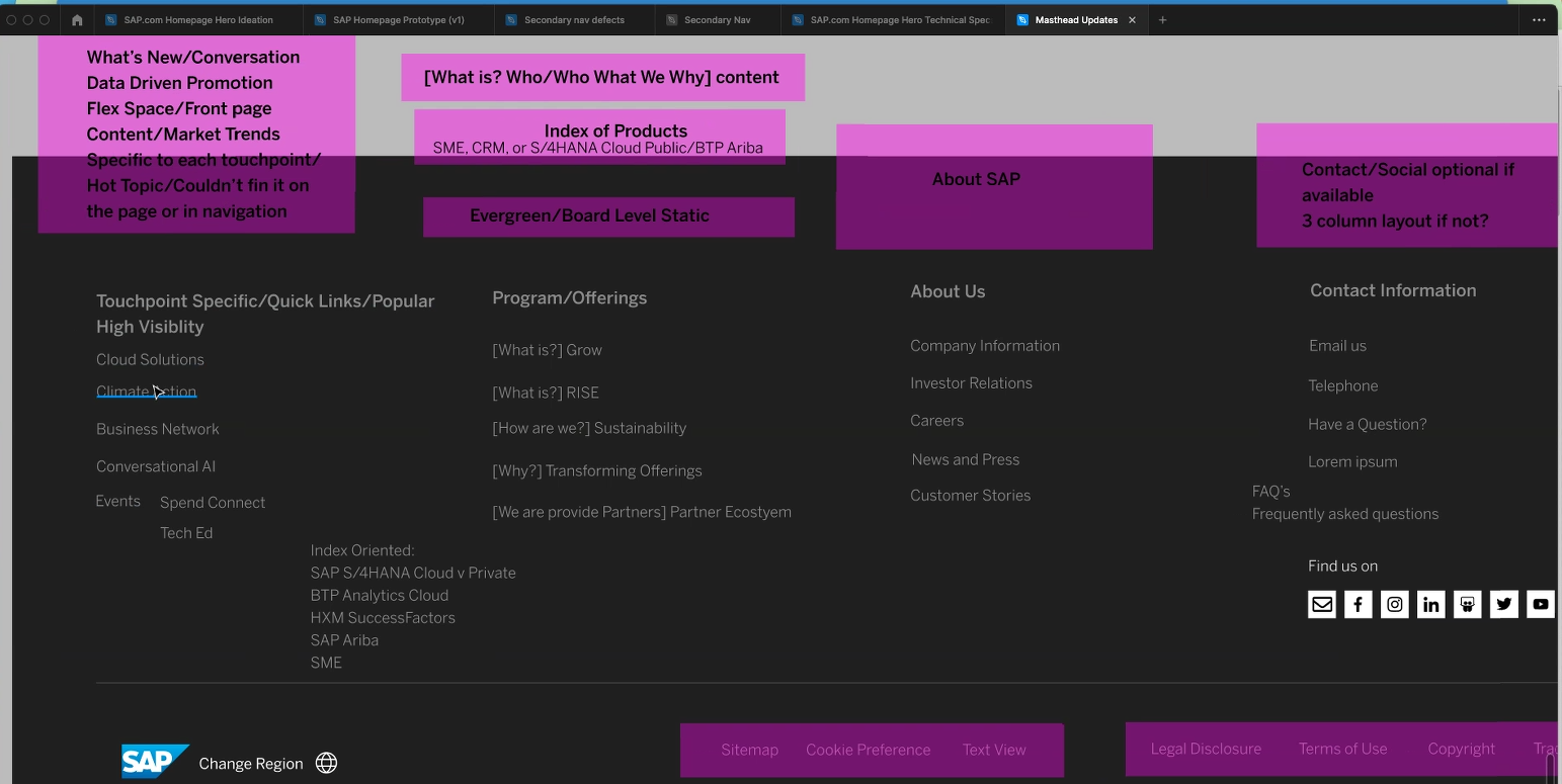
I translated that into the working footer structure - labeling each column by function (Touchpoint-Specific/Quick Links, Program/Offerings, About Us, Contact Information) and annotating open questions as I worked through it: what content lived in each zone, what stayed evergreen versus touchpoint-specific, and where "What is…" links belonged.
Research & validation
Getting seven property teams to agree on a shared system isn't a design problem you solve at a desk - it's a relationship problem you solve through research.
I ran stakeholder interviews with each individual touchpoint owner to understand why their navigation and footer had evolved the way it had, and what they couldn't live without. That fed a continuous loop of communication and feedback with internal teams throughout the project, rather than a single research phase up front - decisions got pressure-tested with the people who'd have to live with them as the system took shape. I grounded that qualitative input with case studies from comparable enterprise properties (the "fat footer" benchmarking above) and ongoing analytics tracking (the Search Console data above), so the taxonomy decisions reflected actual usage patterns, not just stakeholder preference.
What Natalie should add to finish this case study
- Timeline - when this work happened relative to the homepage project.
- A concrete outcome - did this reduce inconsistency complaints, cut down on duplicate content, improve cross-property navigation completion in testing, or something else measurable?
- Your specific role across the seven teams - did you own the system centrally, or work through each property team individually?
- Confirm the Axure prototype screenshots, footer working file, Search Console data, and live-site mega-menu screenshots are OK to publish - same confidentiality check as the other case studies.