Search, one pattern designed for seven touchpoints
I led the redesign of search for SAP.com and its sister sites, from the first working sessions through the options, the decisions, and the handoff of designs and components to the design system.
Every screen on this page is a recreation I made for this portfolio. None of them are original SAP files.
The problem
SAP's sites each had their own search. The plan was one search service, and one pattern, for all seven properties.
I worked with product owners, IT and developers, data analysts, the design system team, and the owners of each property. The scope covered search.sap.com, the search field in the global masthead, and search across SAP's properties.
How I worked
Discover and Define set the problem. Ideate was a weekly working session series. Design and Test ran with developers and stakeholders in the room. Deliver handed components to the design system. Measure fed the next iteration.
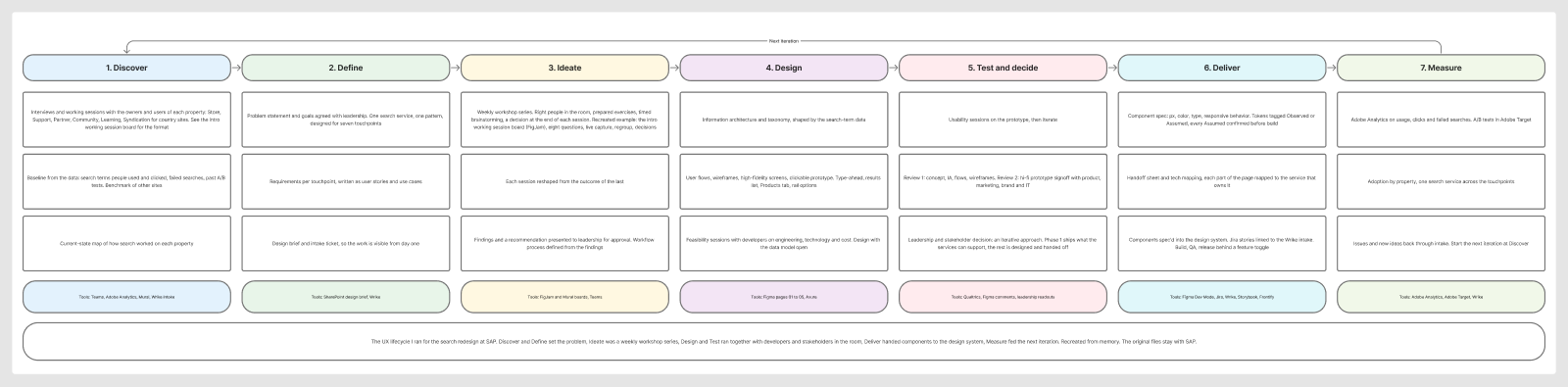
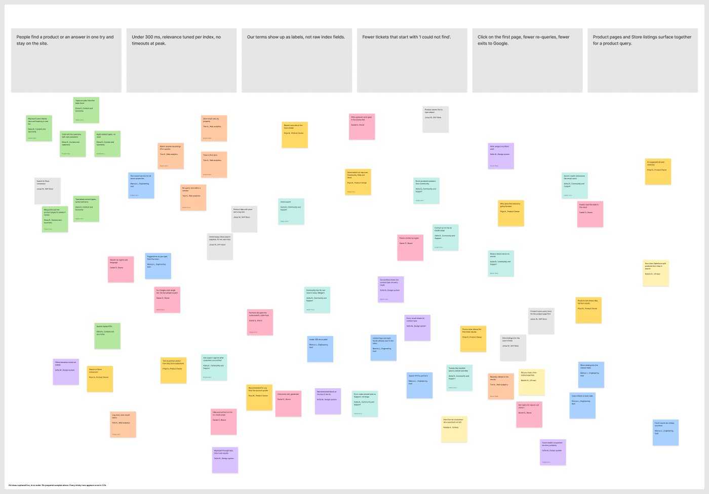
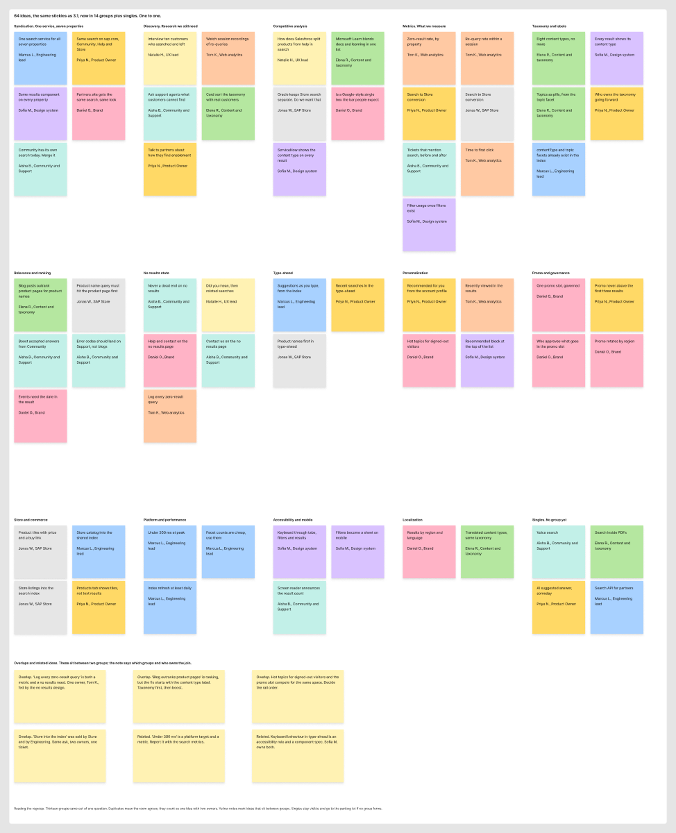
Before any redesign, I ran weekly working sessions on search. I chose who needed to be in the room, prepared the questions, timed the brainstorming, and closed each session with a decision. Each session took the outcome of the one before and reshaped the next. The findings and a recommendation went to leadership for approval, and I defined the workflow process from those findings.
Live capture
Regrouped
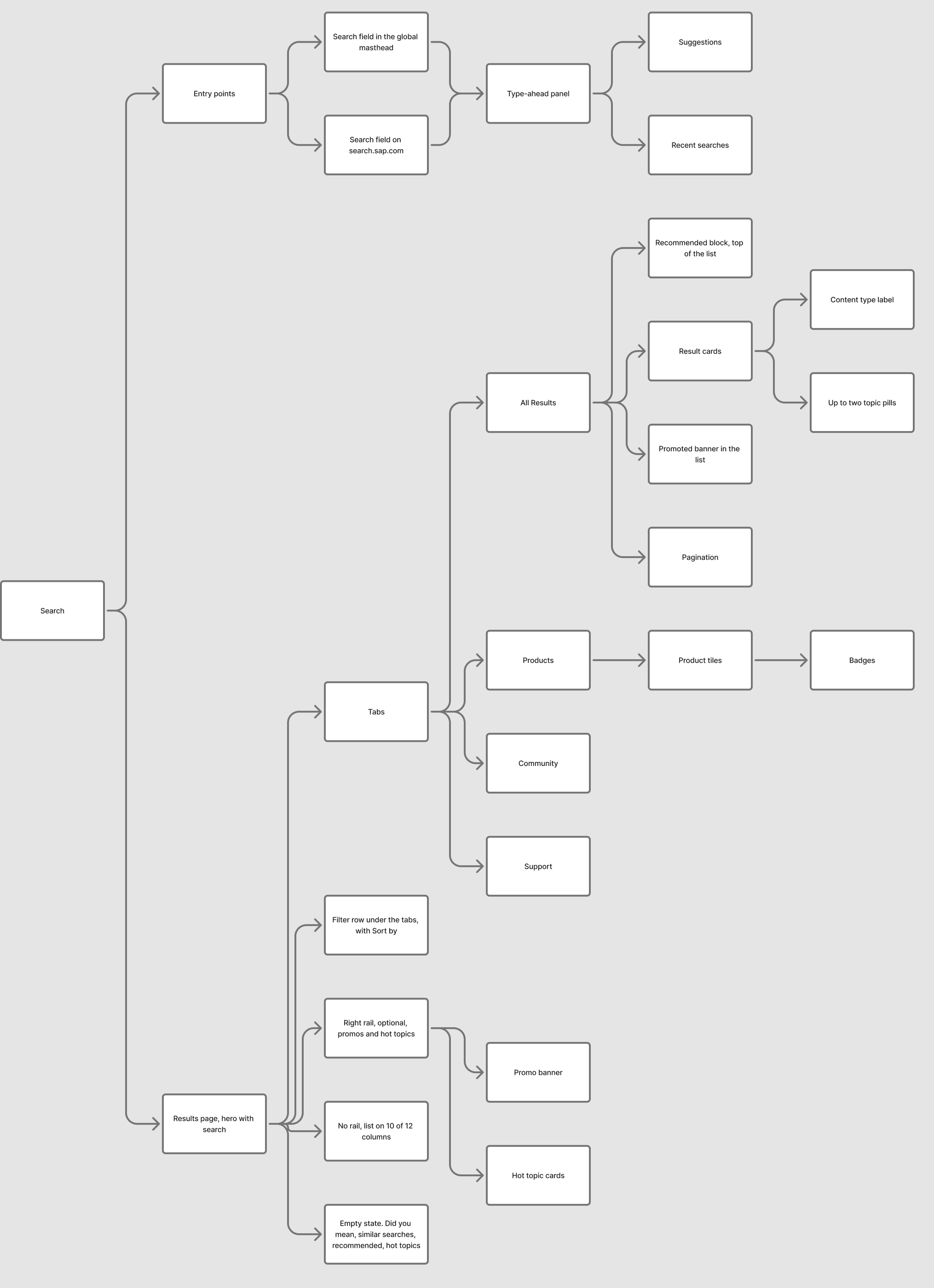
Taxonomy came from measurement. We looked at which search terms people used and clicked, and surfaced those hot spots and hot topics. The search terms shaped the information architecture and the labels on the cards, and the hot topics fed the Trending card. I then worked through the information architecture, designs and a prototype, with working sessions with developers on engineering, technology and feasibility. Leadership and stakeholder discussions ended in an iterative approach for the designs.
Where it started, the Store
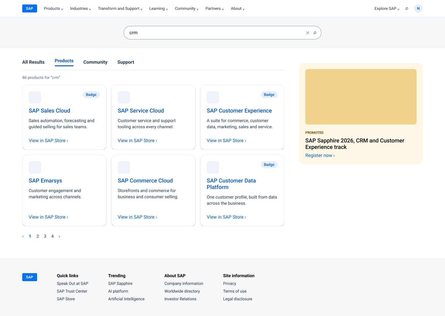
When the SAP Store moved into SAP.com, search had to carry products for the first time.
I designed a Products tab on the results page, with product tiles and badges, and handed the designs and specs to IT.
Options, ordered by effort
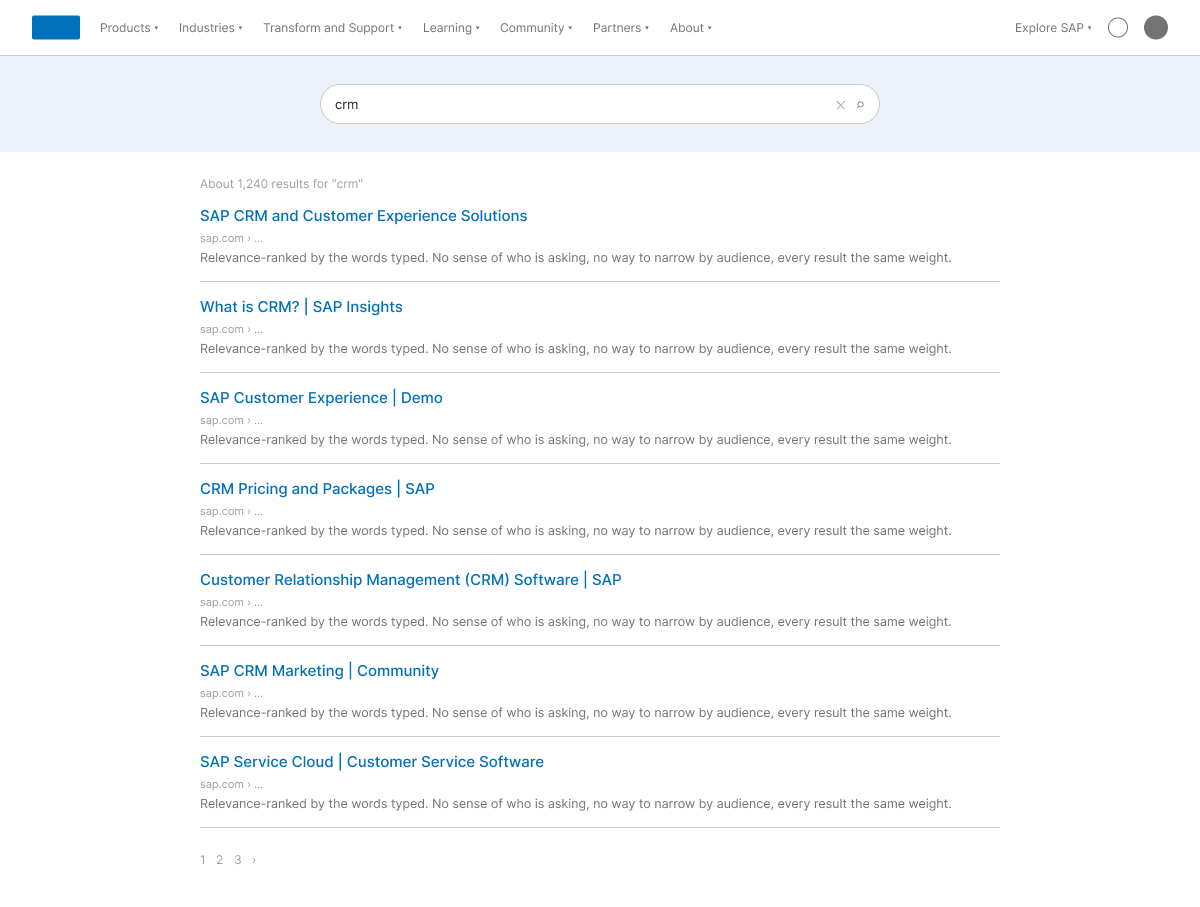
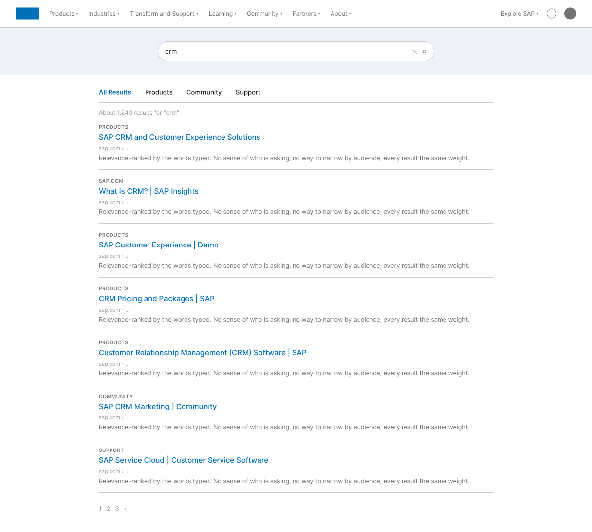
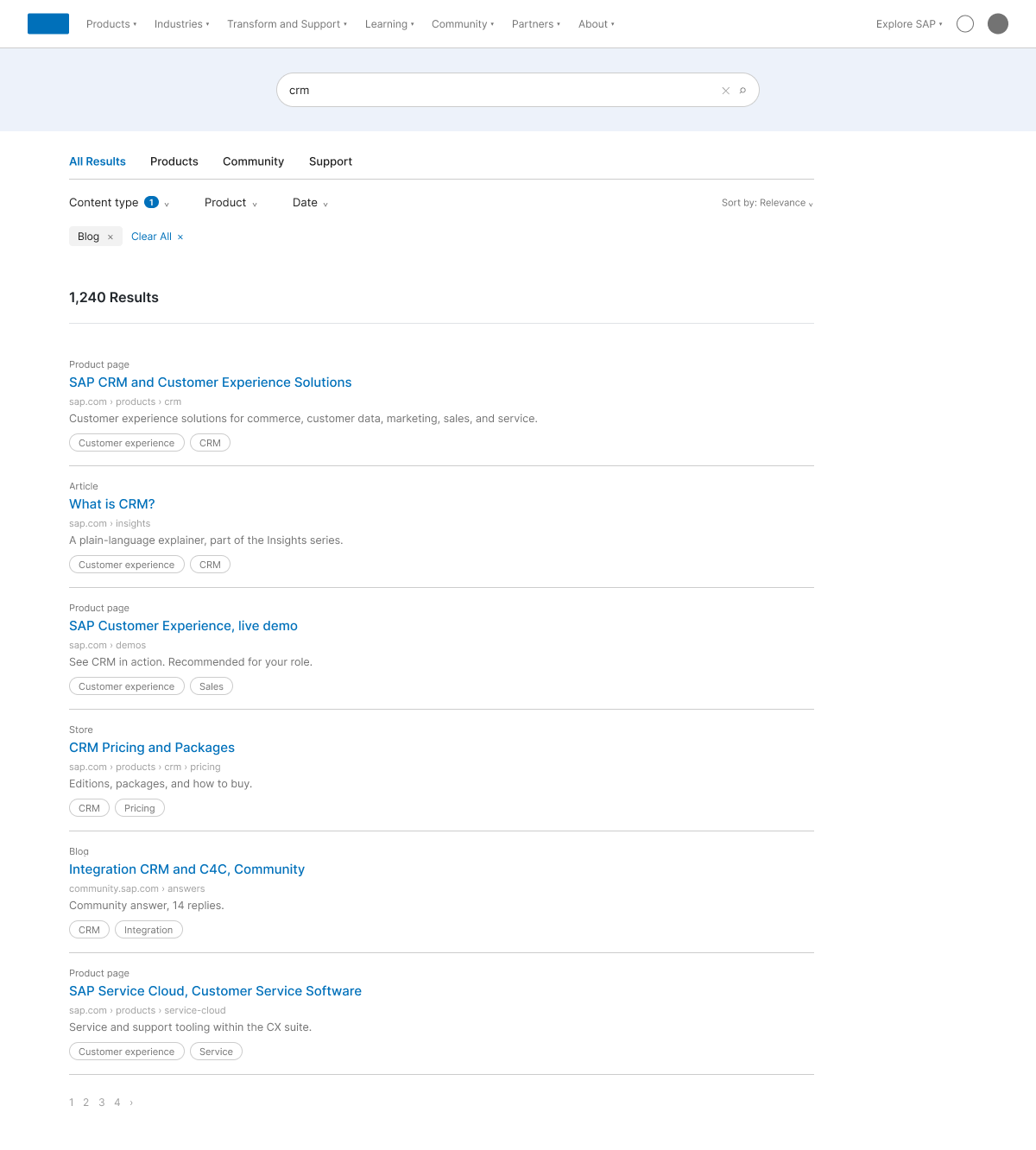
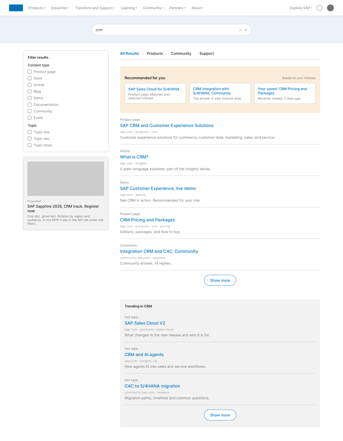
The business needed to pick a phase, so I put the old page and three options side by side, each one costing more to build than the last.
Decisions, in my words
- Tabs follow the company taxonomy. All Results, Products, Community, Support. Tabs say where content lives, not what it is.
- One label system on every card. A content type label and up to two topic pills, so a blog, an article, a product page and a Store page read differently at a glance.
- Filters under the tabs first. A row of dropdowns with Sort by at the right for Phase 1. A side filter rail was built as the second option so an A/B test and more research could decide.
- The rail is for promos and hot topics. One governed promoted slot, never above the first three results. With no rail the list stays on 10 of 12 columns, left aligned, for readability on large desktops.
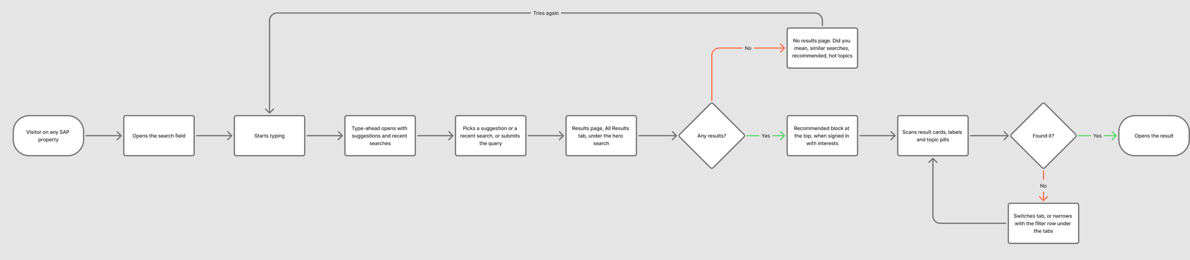
- Recommended sits in the results, not the type-ahead. At the top of the list, drawn from the interests a signed-in person chose in their account profile. Suggestions and past searches stay in the type-ahead.
- No results is never a dead end. A spelling suggestion, related searches, recommended results or hot topics, and a way to reach support.
- Ship in phases. Phase 1 shipped what the services could support. The rest was designed, spec'd as components and handed off.
- One Content type list of eight values that drives both the filter and the card eyebrow. If it is not in the filter, it cannot be an eyebrow.
- Filters in a left rail for the MVP, with the promo under them, five results then Show more, and a Trending block instead of pagination.
- Document the focus, hover and pressed states of every filter control in the spec, not on the wireframe.
- Log zero-result queries, re-queries and filter use before launch, not after, so the baseline exists on day one.
- Where AI helps, it suggests and a person confirms, and every suggestion shows its source.
Type-ahead that remembers you
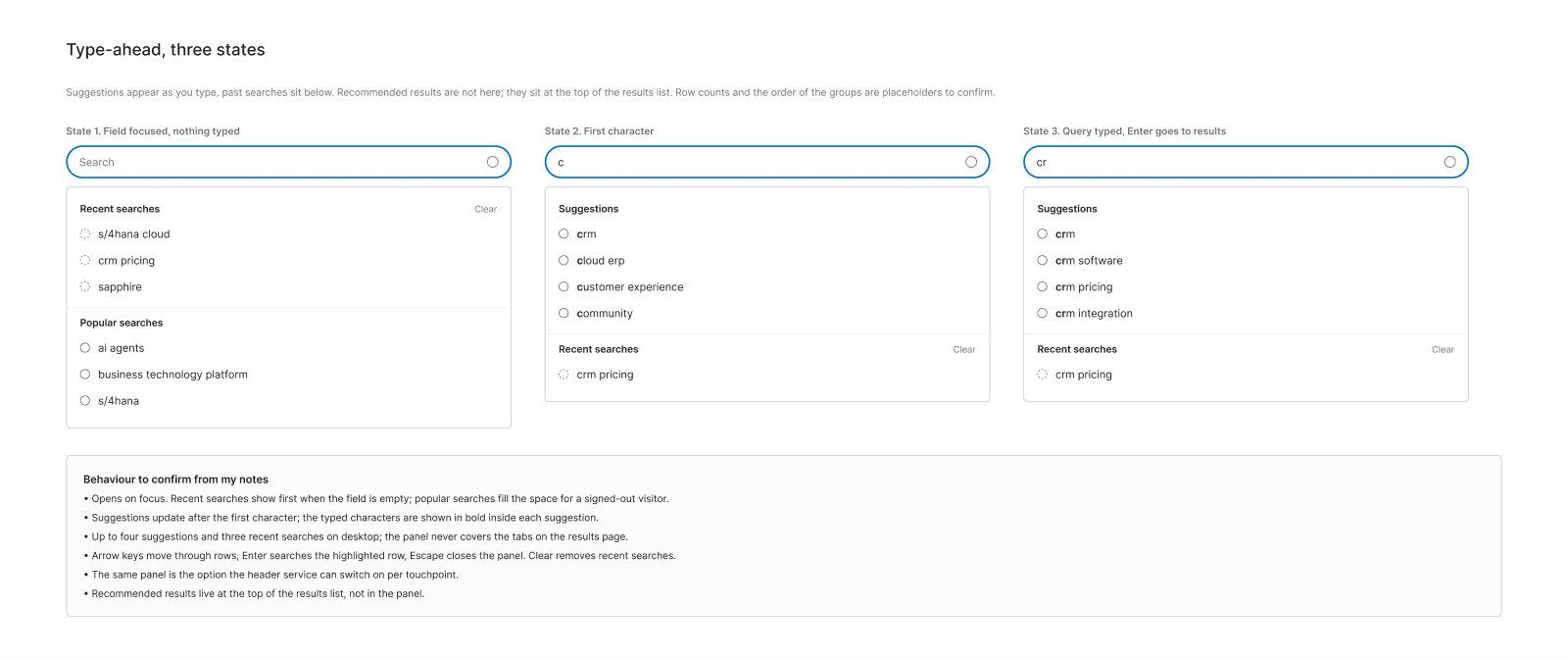
I designed type-ahead for the search field. Suggestions appear as you type, with past searches below.
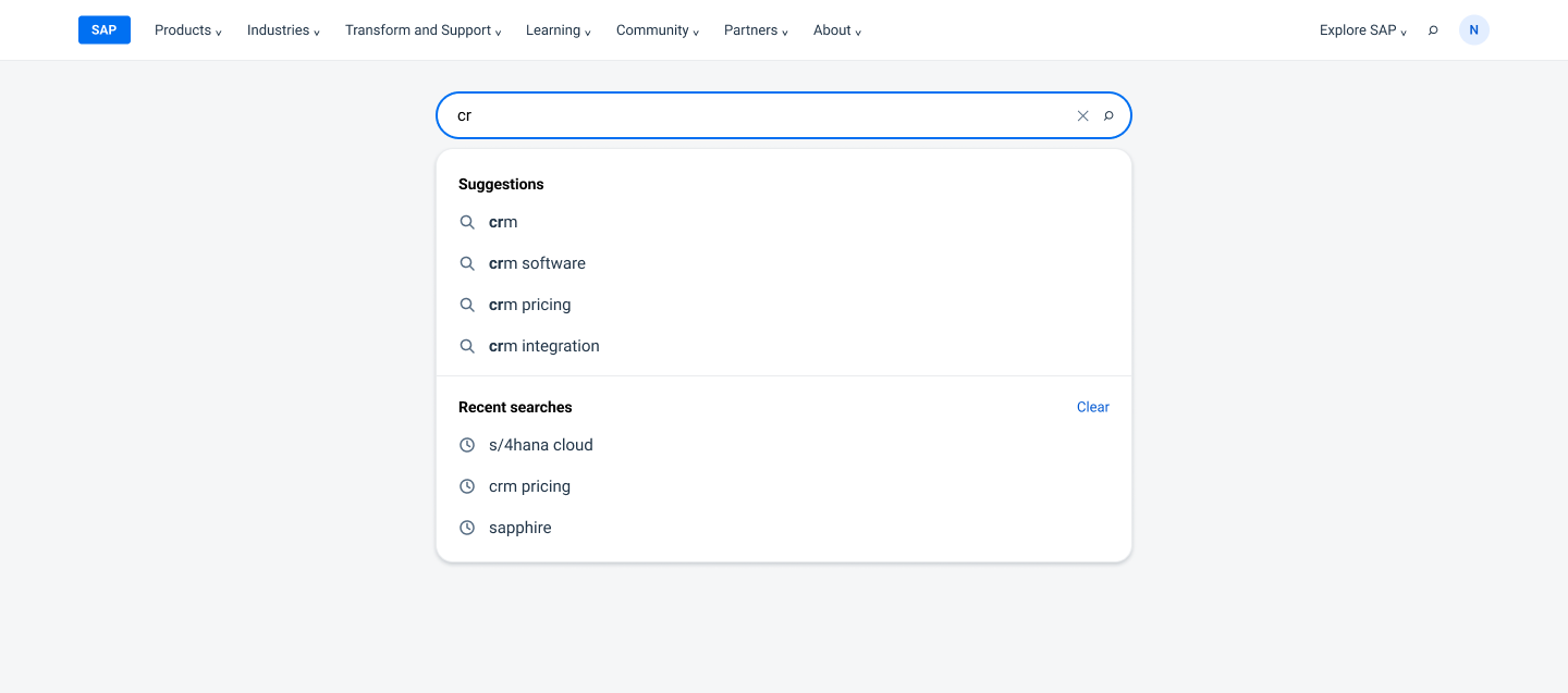
Recommended results sat in the results page itself, at the top of the list. They drew on the interests a signed-in person had chosen in their account profile and dashboard, so search became the second place, after the dashboard, where that data paid off. I designed the recommended block, it was spec'd as a design system component, and I handed it off.
Three states carry the whole panel. Empty, with recent searches. Typing, with suggestions. And a chosen suggestion. The panel never covers the tabs.
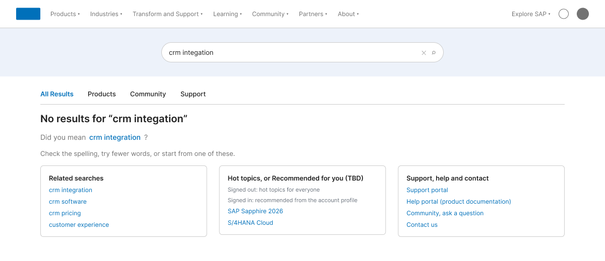
When a search finds nothing
The old results page gave up. The new one offers a way forward.
The no results page suggests a correction with Did you mean, then three blocks. Related searches from the index. Hot topics for everyone, or recommended results from the account profile when signed in. And support, help and contact, so a failed search can still end in an answer.
Handoff
I handed the designs and my components to the design system, so the search patterns became part of the shared library and each property could adopt them.
The Wayfinding pod owned search. I hosted the FigJam working session that kicked it off and the weekly syncs that followed.
The results page itself is documented in SAP's public Digital Design System as the Finders floorplan, with the hero, the tab set and the filter row as I designed them, so any SAP property can build a finder from it.
All seven properties were meant to adopt the same search service through an iterative rollout. I left SAP in December 2025, before I could see whether all seven got there.
The recreated Figma file holds the options, the no results and type-ahead details, the filter states, the style guide and component spec, a handoff pack for three components and a tech mapping example. A FigJam board holds the lifecycle, and a second one holds the working session format with sample input by role.